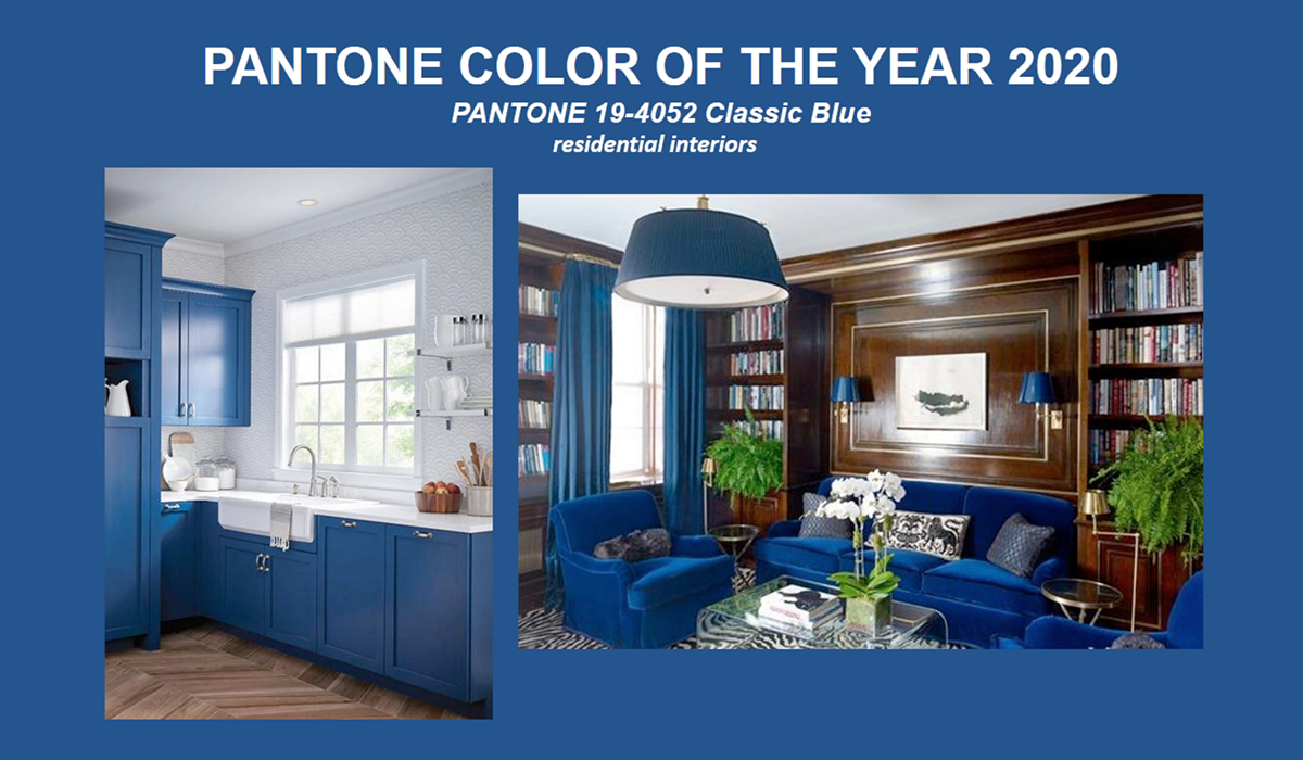
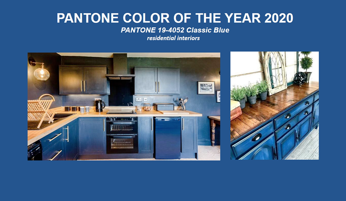
Pantone has announced the color of the year for 2020: Classic Blue. Extensive research and discussions go into choosing the color each year and how it reflects our world: intention-setting, nature, generation, fashion, and home. We think their observations are spot-on, and we’re excited about how that translates to home design and the appliance industry specifically.

Classic Blue gives a reassuring presence and instills calm, confidence, and connection. It is timeless and enduring, offers constancy, and at the same time is vibrant (due to its red undertone).
“Suggestive of the sky at dusk, the reassuring qualities of the thought-provoking PANTONE 19-4052 Classic Blue highlights our desire for a dependable and stable foundation from which to build as we cross the threshold into a new year.” -Pantone
Like the sky, Classic Blue is universal. It is non-aggressive and relatable, allowing it to be comfortably embraced by all. This reflective hue offers refuge and space to re-center. Its calming nature fosters resilience.
From a design perspective, Classic Blue is an anchor shade that lends versatility to an environment. It is genderless and seasonless, making it easy to use in a corporate office, social setting, and in the home.
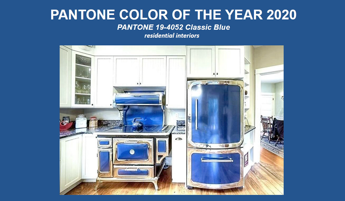
According to Pantone, Classic Blue is the #1 color for kitchens, and we’ll continue to see that in the coming year. It’s fun and elegant and modern all at the same time. For example, painted blue cabinets contrasting against a traditional wood (counters or flooring) suggest a contemporary style. We’re seeing more colored appliances that immediately update your kitchen to a modern look. The blue can also be applied to old-fashioned style appliances, making a dramatic statement with traditional design. The boundless options of Classic Blue make it easy to embrace for 2020. Contact us to see how to introduce the color of the year to your home!


